Project: AGE of GLOW
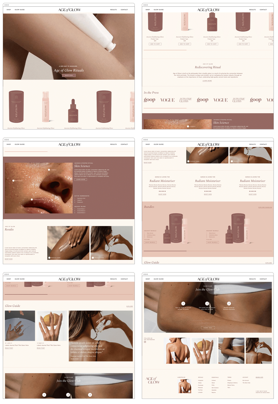
Brand Identity, Packaging + Website Design
Lead Designer: Lauren Rowe
Agency: Smack Bang
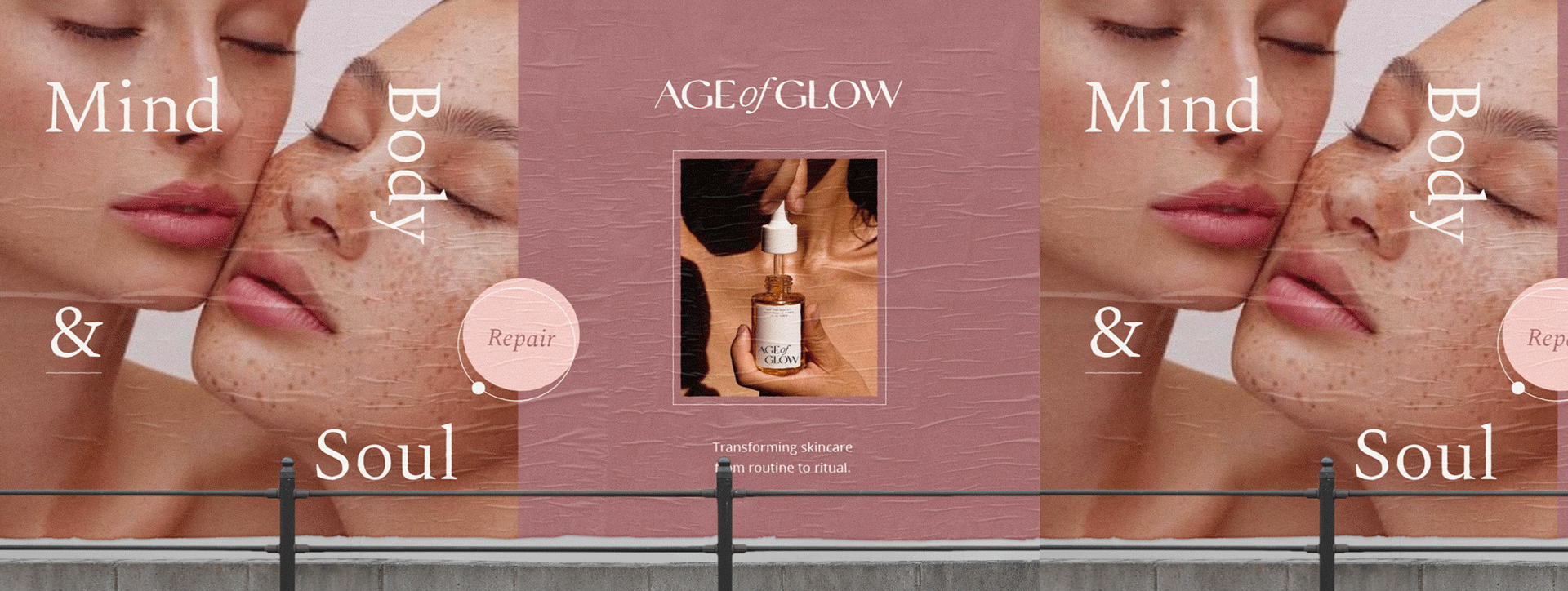
In today’s world of filters, we’re being sold a narrowing view of beauty — one that is limited as it is dangerous. With an easy edit and quick fix, we’ve expected an unrealistic standard of beauty within a matter of seconds. But an honest glow and real radiance come from self-love, care and confidence.
The chosen concept was dedicated to the daily ritual - One that allows our audience to pause and reflect. Encouraged to connect with their true selves, our audience is engaged with our brand and open to a sense of radiance in reality.
The custom designed typeface uses a unique water drop letter-form within the “G” to portray Age of Glow’s softness and mindfulness. This also symbolises the core element of activation of the exfoliation ritual.
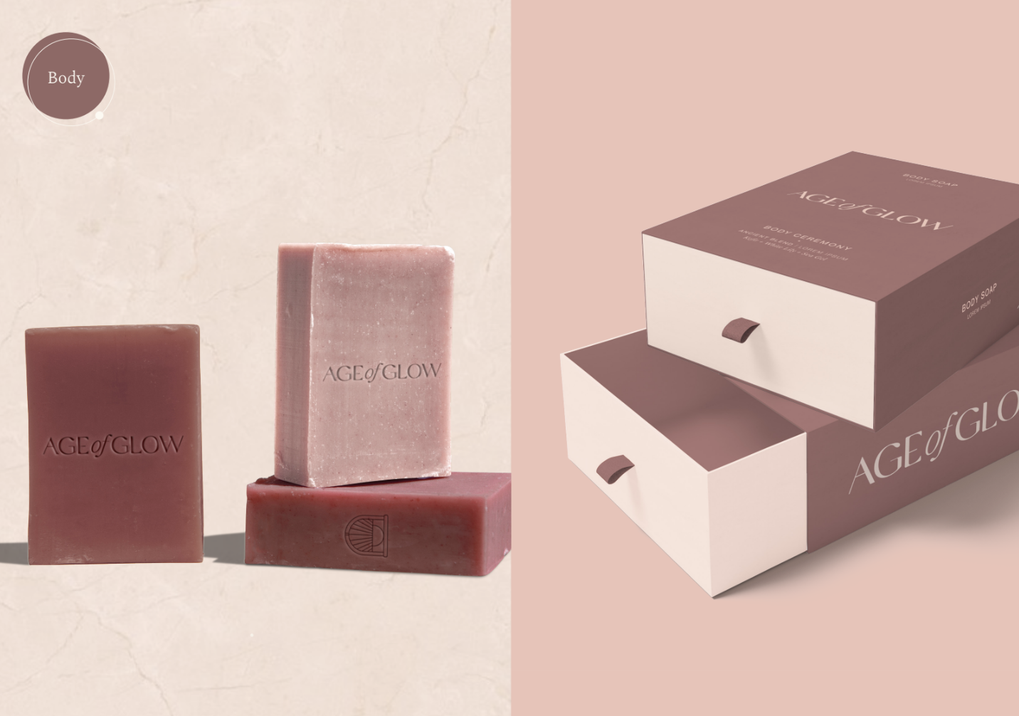
The packaging concept was dedicated to the daily ritual Morning, Noon and Night - one that allows our audience to pause and reflect.
The dot seen across the packaging is a reminder to pause morning, noon and night, to nurture one’s mind and body where true beauty lies.
Soft feminine colours are used to create an alluring, playful brand personality that will stand out from competitors. Each brand colour has also been used to categorise the products for future expansion. Soft silk touch packaging evokes the feel of your refreshed and revitalised skin after using Age of Glows products.
Smack Bang - Design Agency
Lead Graphic Designer & Art Director: Lauren Rowe
Designer: Shopie Mcnay
Brand Philosophy
Age of Glow is built on the philosophy that a healthy glow is a result of nurturing the connection between the mind and body. The brand is a unique and mindful, set on reshaping the beauty industry with a holistic approach that incorporates the importance of ritual through high-quality, ancient tools and ingredients. Their range of thoughtfully considered and cleverly created products are both inclusive and empowering.


